
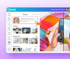
5 Ways to Create Professional Graphics in Minutes with Canva
Have you ever looked at beautiful graphics online and thought creating them must take special skills or expensive software? What if I told you that you could make professional designs in just minutes, even if you’ve never designed anything before?
Overview
The five methods I’m about to share will help anyone create stunning graphics quickly using Canva. Each technique takes between 5-15 minutes to complete, making them perfect for busy people who need professional results without spending hours learning complex design software. These approaches are beginner-friendly, though some optional advanced tips are included for those who want to take their designs even further.
Basic Guidelines for Creating Professional Graphics
Before diving into specific methods, understanding a few fundamental design principles will dramatically improve your results:
The rule of thirds divides your image into a 3×3 grid. Placing key elements along these lines or at their intersections creates more appealing compositions. Canva actually shows you these guidelines when you’re moving elements around.
Color harmony forms the foundation of professional designs. Limit yourself to 3-4 complementary colors to create a cohesive look. Canva’s color wheel feature helps identify colors that work well together by showing you complementary and analogous color options automatically.
Typography significantly impacts how professional your design appears. Select no more than two font styles per design—typically one for headlines and another for body text. Canva offers font pairing suggestions to help you make good choices.
White space (empty areas around design elements) isn’t wasted space—it’s an essential design element that helps your content breathe and appear more organized. Resist the urge to fill every available space.
While Canva stands out for its ease of use and extensive template library, alternatives include Adobe Express, Visme, and Crello. Canva distinguishes itself through its intuitive drag-and-drop interface and vast collection of free elements. Adobe Express offers more advanced editing capabilities but has a steeper learning curve. Visme specializes in data visualization but lacks Canva’s template variety.
Step-by-Step Instructions
Method 1: Template Customization Magic
- Log into your Canva account (or create a free one).
- In the search bar, type what you need (e.g., “Instagram post,” “presentation,” or “business card”).
- Browse templates and select one that roughly matches your vision.
- Replace the placeholder text by clicking on it and typing your content.
- Change images by selecting them and clicking “Replace” from the toolbar above.
- Update colors by selecting elements and using the color tool in the top menu.
- Adjust font styles by highlighting text and selecting new options from the text toolbar.
- Download your design in your preferred format (PNG for web use, PDF for printing).
Pro Tip: Choose a template with a layout similar to what you need to minimize adjustments and save time.
Method 2: Brand Kit Setup for Consistency
- If using Canva Pro, navigate to the Brand Kit section in the left sidebar.
- Upload your logo and add it to your Brand Kit.
- Define your brand colors by entering hex codes or using the color picker.
- Select 2-3 fonts for headlines, subheadings, and body text.
- When creating new designs, access your Brand Kit from the side panel.
- Apply your brand elements with one click to any design element.
- Create templates with your branding pre-applied for future use.
Pro Tip: Even with the free version, save your brand colors in a document for easy reference and consistency across designs.
Method 3: Quick Photo Editing and Enhancement
- Upload your photo to Canva or select one from their free library.
- Click on your image to reveal editing options.
- Use the “Adjust” panel to modify brightness, contrast, and saturation.
- Apply a filter from the “Filter” tab to create a consistent look.
- Add text overlay by clicking the “Text” button and selecting a style.
- Position your text in a readable location, typically with dark text on light backgrounds or vice versa.
- Consider adding your logo as a small watermark in one corner.
Pro Tip: Enhance ordinary photos by adjusting the “Clarity” and “Vignette” settings to create more professional-looking images.
Method 4: Grid Layouts for Multiple Images
- Search for “grid” in Canva’s templates or elements section.
- Select a grid layout based on how many images you want to display.
- Click on each grid cell and select “Replace” to add your images.
- Adjust individual images within cells by double-clicking and repositioning.
- Add a consistent filter to all images for a cohesive look.
- Consider adding a thin border in a brand color around each image.
- Add text if needed, keeping it minimal and aligned with the grid structure.
Pro Tip: For Instagram posts, create carousel posts using multiple pages in Canva with consistent design elements across each slide.
Method 5: Data Visualization Made Simple
- Decide what type of data you need to present (comparison, trends, parts of a whole).
- Select the appropriate chart type from Canva’s “Elements” > “Charts” section.
- Click the chart to input your data manually or paste from a spreadsheet.
- Customize colors to match your brand palette.
- Add a clear, concise title above or below your chart.
- Include a brief explanation if the data needs context.
- Consider adding your logo or data source as a small credit line.
Pro Tip: Limit each graphic to one main data point or comparison to avoid overwhelming viewers.
Other Creative Alternatives
Beyond the five main methods, consider these creative approaches:
Create animated graphics using Canva’s animation features. Select your finished design, click “Animate” in the top menu, and choose a subtle animation style. This works especially well for social media posts.
Explore Canva’s “Elements” library for illustrations, shapes, and icons that can enhance your designs without requiring advanced skills. Combining simple elements often creates more interesting results than complex techniques.
Try using Canva’s background remover tool (available in Canva Pro) to create professional-looking product images or portraits without elaborate photography setups.
Conclusion
Creating professional graphics doesn’t require years of design experience or expensive software—just a few minutes and these straightforward techniques in Canva. By following these guidelines, you’ll develop confidence in your design abilities and create consistent, high-quality visuals that elevate your brand or project. Start with one method today, and watch how quickly your graphic design skills improve!
FAQ
Do I need to pay for Canva to create professional graphics? Canva’s free version offers plenty of features to create professional designs. The paid version (Canva Pro) includes additional benefits like background removal, more templates, and Brand Kit functionality, but you can absolutely create impressive graphics using just the free version.
I’m completely new to design. Which method should I try first? Start with Method 1: Template Customization. This approach requires the least design knowledge while still producing professional results. As you grow more comfortable, experiment with the other techniques.
How do I ensure my graphics look good on different devices and platforms? When creating designs for multiple platforms, use Canva’s resize feature to automatically adjust your designs for different formats. Always preview your designs on both desktop and mobile devices before publishing to ensure text remains readable and important elements aren’t cut off.
Can I use Canva graphics for commercial purposes? Yes, you can use Canva designs for both personal and commercial purposes. However, pay attention to the licensing of individual elements—some premium photos or elements may have usage restrictions. Canva clearly marks which elements are free and which require a Pro subscription.
How do I create a consistent look across all my graphics? Consistency comes from using the same colors, fonts, and visual style across all designs. Create a simple style guide documenting your brand colors (with hex codes), font choices, and logo placement preferences. Reference this guide whenever creating new graphics.
My designs still don’t look professional. What am I missing? The most common issues are cluttered layouts (too many elements) and inconsistent styling. Try removing 20% of your design elements and ensuring all text uses the same 1-2 font families. Sometimes less truly is more when it comes to professional design.